Tap fullscreen and start to scroll
PLATE 01 · WHAT THIS ISREAD THIS FIRST
An amuse-bouche. One does not taste it to know the meal — one tastes it to know the cook.
This is a taste. Not the finished brand — a demonstration of the thinking and the system, drawn in drafts, with the name and the logo withheld on purpose. What follows is the how, never the final artwork; the next page shows exactly where in the process we are. Read it as one thing: each page is a direction, and the directions are cut to fit together — a world, not a menu of options. That world stands on two foundations and no decoration: authorship, a point of view carried through every decision, and a product that earns it. It begins at the product and expands outward — into art, into culture, into education — until the pieces stop reading as marketing and read as a single place, where taste is communicated with confidence. And it holds without smoke and mirrors, because beneath the world is a product that scales, and delivers on the promise it makes.
HALL OF SWORD01 / 25
PLATE 02 · THE PROCESSA REPEATING CYCLE
HALL OF SWORD02 / 25
PLATE 03 · THE POSITIONWHO IT’S FOR
Not the influencer’s oil. Not the purist’s. The one the ordinary buyer reaches for instead.
Picture the shelf. There is the influencer’s bottle — bought for the feed, not the food. There is the purist’s — the single-estate trophy you cross town and pay a ceremony for. And there is the mass incumbent — cheap, ordinary, everywhere. None of them is the target. The buyer we want is the one standing in front of all three and reaching for the honest upgrade: genuinely better oil that still behaves like an everyday one.
Graza is the north-star — but that win happened in America. The ambition is theirs; the crossing to Sweden is the work. We are not chasing the people who already trek across town for their oil. We are converting the ordinary buyer one notch up — a real step in quality, sold plainly, at a price that keeps it in the basket. The gap between “better” and “still everyday” is the whole opening, and nobody owns it yet.
HALL OF SWORD03 / 25
PLATE 04 · THE PRECEDENTSWEDEN ALREADY TRADED UP
Sweden has done this before. More than once.
This isn’t a hypothesis — the same Swedish buyer has traded up category after category, in living memory. Craft beer came first, premiumising a commodity into a scene. Specialty coffee: a daily ritual, quietly upgraded. Natural wine: demand forced even the state monopoly to stock it — Systembolaget resisted in 2012, then followed. Same buyer, same move — trade up the moment the better version is within reach. Pantry oil is next.
HALL OF SWORD04 / 25
PLATE 05 · THE PROOFSIXTY SLIDES, IN ONE
We read the whole category. Graza is the proof.
Nº 01 · GRAZAthe proof
raised → valuation, in ~3 years
record lives outside the markupREAD →
Nº 02 · GRAZAthe budget
= the entire first-8-month ad budget
record lives outside the markupREAD →
Behind these two numbers sits a 60-section intelligence file. We’re not sending it — each card reads its own source record, and the record lives outside the deck (a row, a section) — pointed at, never linked. The proof is total; the dossier stays in the kitchen.
HALL OF SWORD05 / 25
PLATE 06 · THE MECHANISMTHE CHANNEL AND THE MESSAGE
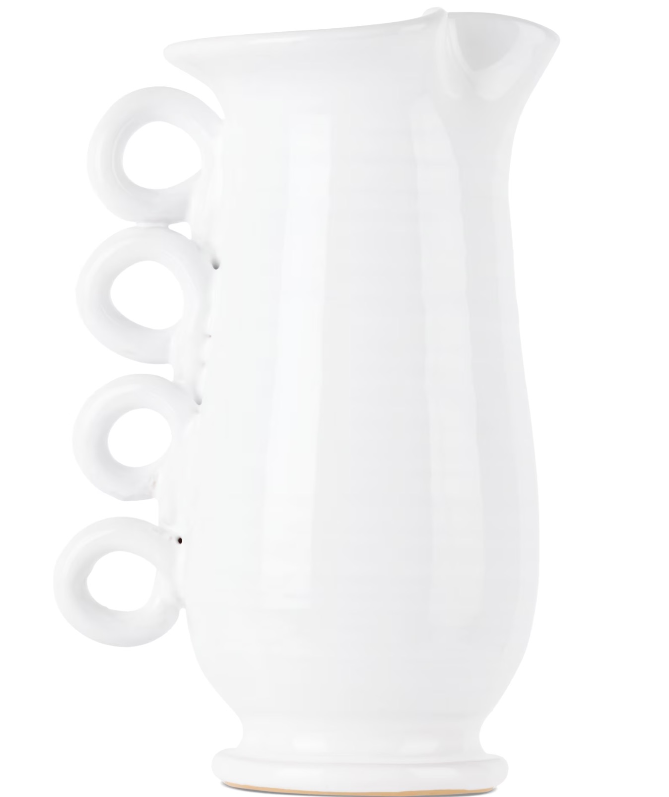
The package is the channel. The label is the message.
Graza taught the whole category one thing: the bottle on the counter is the advertising. It works while it simply sits there — no media buy, no feed, just the object earning its keep every time someone cooks. So the package stops being decoration and becomes the growth strategy — and that is the first advantage. A genuinely nice object is not only nice: on a shelf of sameness it is the differentiator, the one people want out on the counter, the reason a hand reaches for it instead of the other.
The second advantage is the surface everyone forgets: the label. Most brands treat it as a sticker — a name, a volume, a barcode — and stop there. It is far more than that. If the package is the channel, then the label is the message: the one place you hold a buyer’s full attention, and a great way to actually say something. How we’d use it — starting with olive oil — comes a little further on.
HALL OF SWORD06 / 25
PLATE 07 · THE ROUTESSCOPED THE MARKET · YOU PICK THE LOOK
The look is the owner’s call. We scoped every direction first.

The aesthetic direction — the fonts, the colours, the final look — needs more of your input; that is the owner’s call, not something a pitch should lock. What we have done is scope the market across every direction, a sampling of it here. So this document stays on the strategy around the packaging and the label, not the typeface or the palette. Choose the lane, and the system renders it.
HALL OF SWORD07 / 25
PLATE 08 · THE EDUCATIONCOOK · LAYER · FINISH
Graza taught two moves. We add the middle one.
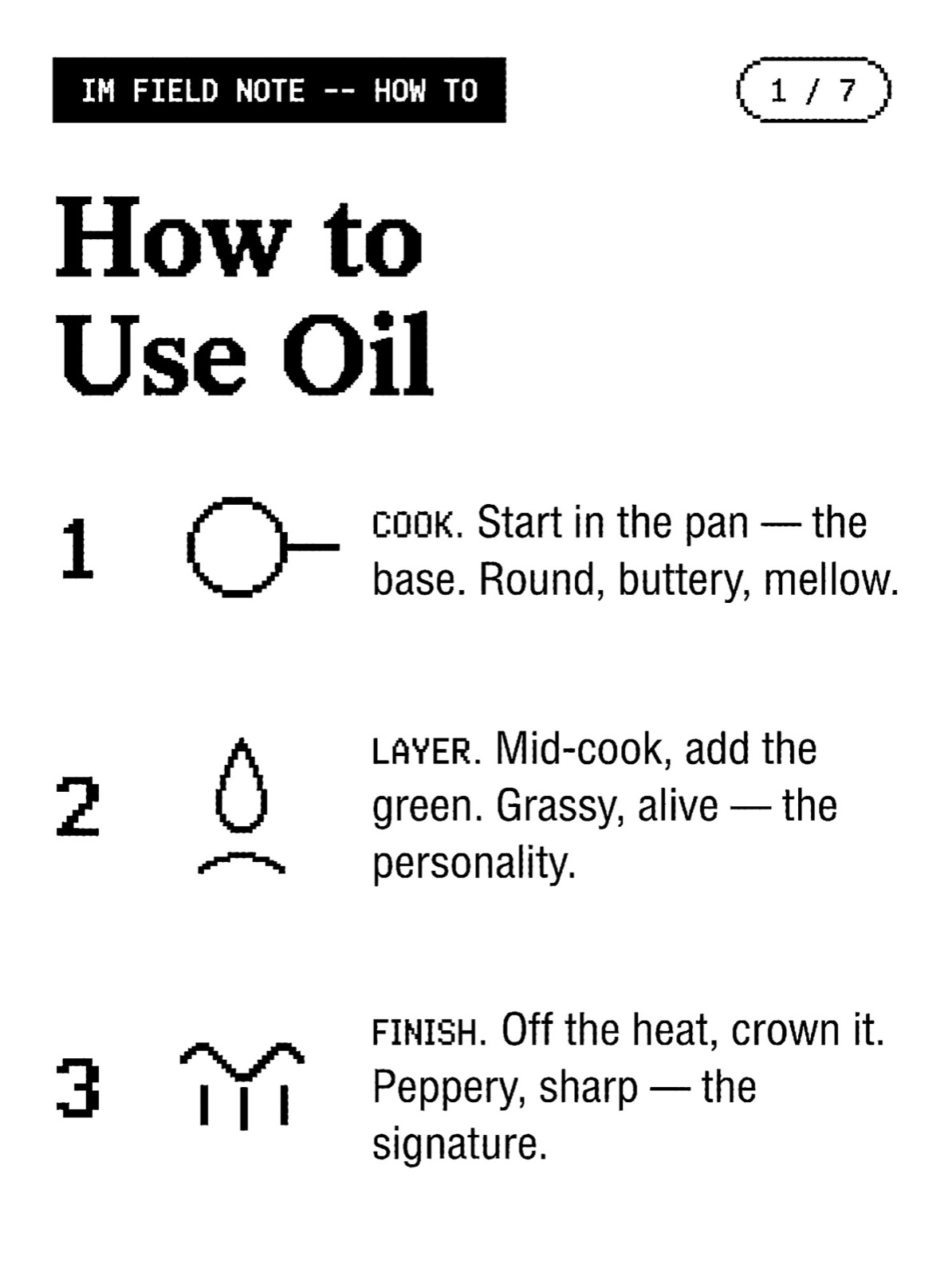
Three oils, not two — and all three are the lesson: cook teaches the base, layer teaches the middle nobody else names, finish teaches the crown. This is one sample of IM’s educational content: a “how to” the brand owns, made to be watched and saved, not skipped.
The engine makes hundreds more — how to layer, how to finish, how to read an oil by its colour — each one another reason to reach for the bottle. The next page teaches the rest: how much you use, and what it costs. →
The education rides inside content people actually want — a field note, a carousel, a “how to.” One sample; the real brief carries a library of them.
HALL OF SWORD08 / 25
PLATE 09 · THE POUR LADDERHOW MUCH YOU USE · WHAT IT COSTS
The less you pour, the more it costs.
N° 01 · COOKthe base
price — low · the everyday
record lives outside the markupREAD →
N° 02 · LAYERthe middle
price — mid · the personality
record lives outside the markupREAD →
N° 03 · FINISHthe signature
price — high · the premium
record lives outside the markupREAD →
The whole ladder in one line: the less you pour, the more it costs. Cook you pour freely (the base, priced low), Layer by the half-pour (the middle), Finish is a drizzle (the signature, the premium) — three oils, three price points, taught in one pour. Hover a card to read the record.
HALL OF SWORD09 / 25
PLATE 10 · THE ASSEMBLYHOW TO BUILD A DISH
The three oils, exploded.
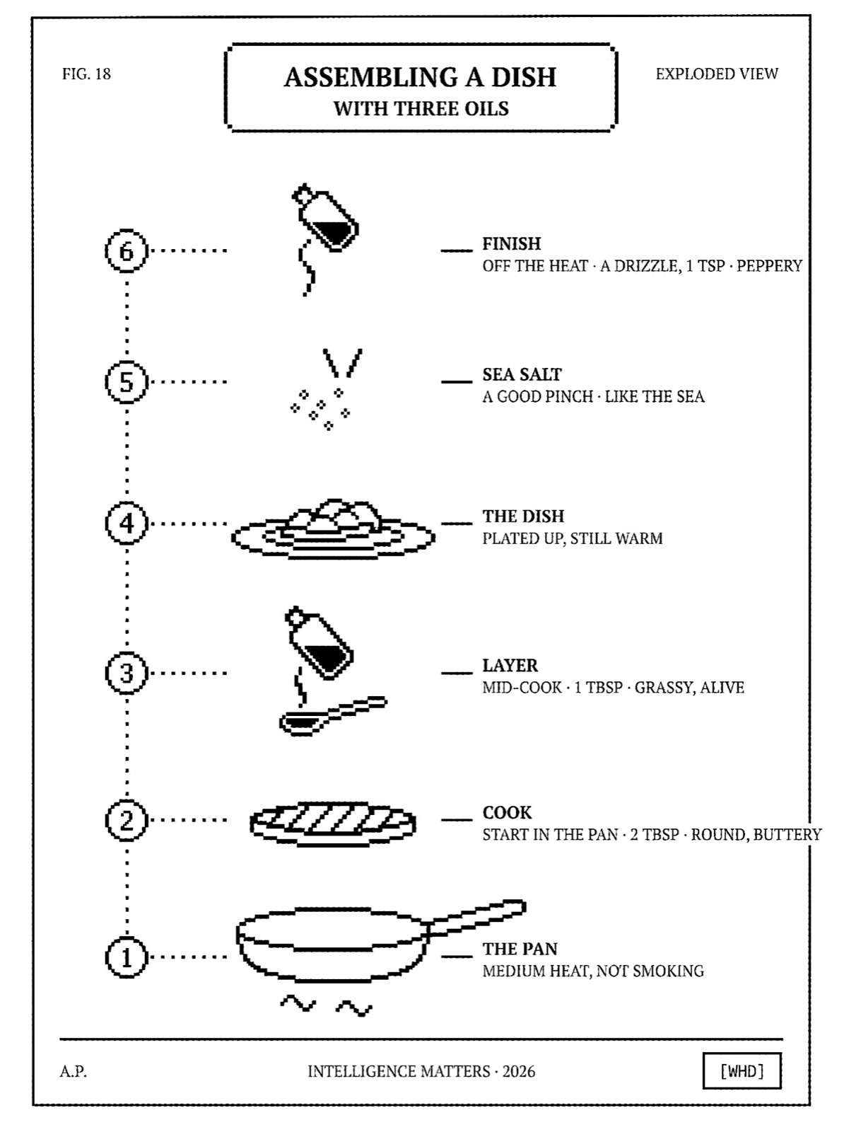
The education, drawn as an assembly diagram (à la Tom Sachs) — the dish exploded into layers, each oil at its stage, each with a measurement. Crude by hand, precise by number: the instruction becomes the identity. A poster you’d actually pin up.
It teaches more than a recipe. Acidity, texture, origin, age — everything the range sells gets taught the same way, connected: how a palette builds, and why it matters. Taste the difference, buy differently.
HALL OF SWORD10 / 25
PLATE 11 · THE COLOURONE LIBRARY · EVERY PRODUCT
Every product, one library of colour.
THE LIBRARY · SORTED BY FAMILY
GREENolive oils
13-1000
14-1371
15-1742
16-2113
17-2484
18-2855
13-3226
14-3597
15-3968
16-4339
17-4710
18-5081
13-5452
14-5823
15-6194
16-6565
YELLOWinfused / citrus
13-2600
14-2971
15-3342
16-3713
17-4084
18-4455
13-4826
14-5197
15-5568
16-5939
17-6310
18-6681
13-7052
14-7423
15-7794
16-8165
BROWNvinegars
13-4200
14-4571
15-4942
16-5313
17-5684
18-6055
13-6426
14-6797
15-7168
16-7539
17-7910
18-8281
13-8652
14-9023
15-9394
16-9765
BEIGEsalt / pantry
13-5800
14-6171
15-6542
16-6913
17-7284
18-7655
13-8026
14-8397
15-8768
16-9139
17-9510
18-9881
13-1253
14-1624
15-1995
16-2366
GREENfresh / vivid
13-7400
14-7771
15-8142
16-8513
17-8884
18-9255
13-9626
14-9997
15-1369
16-1740
17-2111
18-2482
13-2853
14-3224
15-3595
16-3966
The colour isn’t decoration — it’s a fact about what’s inside, picked label by label to match the actual content. An early harvest presses green: unripe fruit, more chlorophyll, a sharper, grassier taste. Wait longer and the same grove turns gold — riper, milder, buttery. Colour, taste, origin and age are one continuous fact, not four separate choices. Sorted, the library reads as five families — two greens, citrus yellow, vinegar brown, pantry beige; shuffled, the same chips become a field. Either way, the system teaches before it decorates — educational first, art second.
HALL OF SWORD11 / 25
PLATE 12 · THE LABEL SYSTEMONE SYSTEM · A SHADE PER PRODUCT
HALL OF SWORD12 / 25
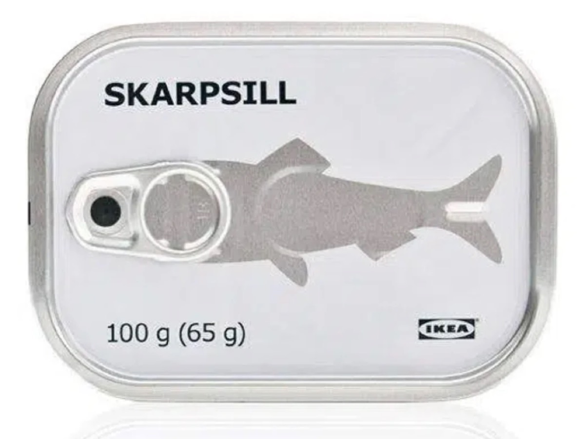
PLATE 13 · THE RANGETHREE OILS · A SHADE EACH
Three oils. A shade each.
CookN° 001
START IN THE PAN · 3 TBSPROUND, BUTTERY500 ML · EVERYDAY
COOKthe base · lightest
LayerN° 002
MID-COOK · 2 TBSPGRASSY, ALIVE500 ML · EVERYDAY
LAYERthe middle · mid
FinishN° 003
OFF THE HEAT · 1 TBSPPEPPERY, SHARP350 ML · SINGLE-ESTATE
FINISHthe signature · deepest
One system, three products, a shade each — colour comes later. The label never changes; only the band does, climbing from a light Cook to a mid Layer to a deep Finish. These greys are placeholders — no real design job done yet.
HALL OF SWORD13 / 25
PLATE 14 · THE DUAL LENSTHE PRODUCT / THE FAMILY
The front is the product. The back is the family.
Face A — frontthis product · its shade
Face B — backthe whole range
The front sells this oil — the shaded band standing in for its eventual colour. Turn it, and the back reveals the whole range: the Cook·Layer·Finish cycle and the swatch library that maps it. One object tells you the product and where it sits in the family.
HALL OF SWORD14 / 25
PLATE 15 · THE COLLABORATIONSCOMMISSIONED ART · WITH A PURPOSE
Commissioned art is beautiful. We made it mean something.
ARTIST
collab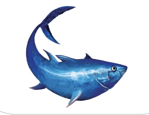
collab
The fishcommissioned · beautiful
ARTIST
collab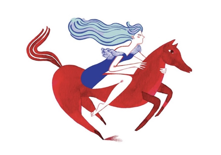
collab
The riderpainterly · decorative
ARTIST
collab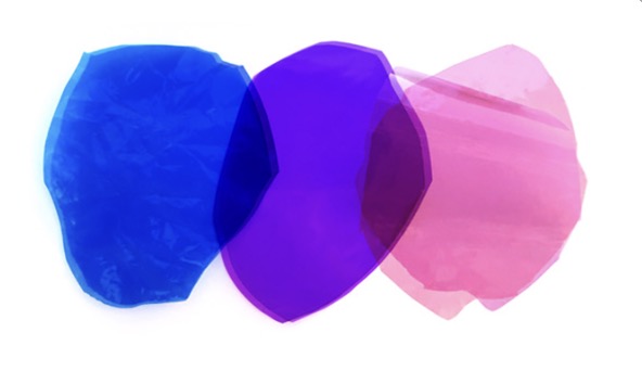
collab
The colourpretty · no brief
The three above are commissioned art in the José Gourmet register — and they are gorgeous. But that is the whole of it: beautiful, with no strategic or conceptual job beyond looking good. We saw that as the opening — art on the label that earns its place: it signals a seasonal flavour, sets a vibe, or teaches the oil. So we took it further. The next page is what we did.
HALL OF SWORD15 / 25
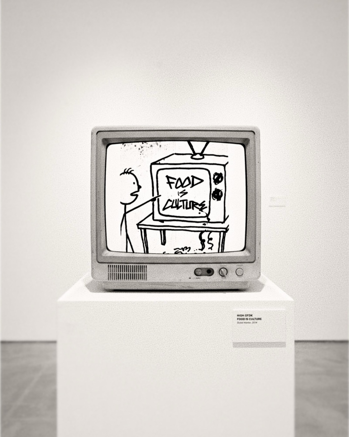
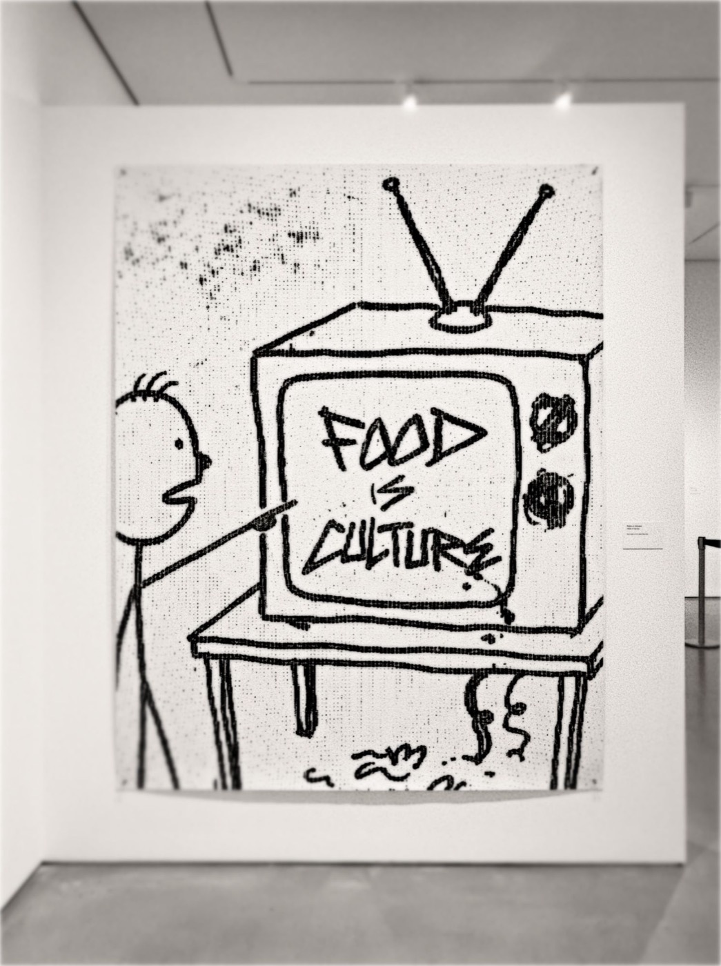
PLATE 16 · FOOD WISDOMALWAYS-ON · SAID PLAINLY
Art as an educational vehicle. The cooking sayings we believe in.
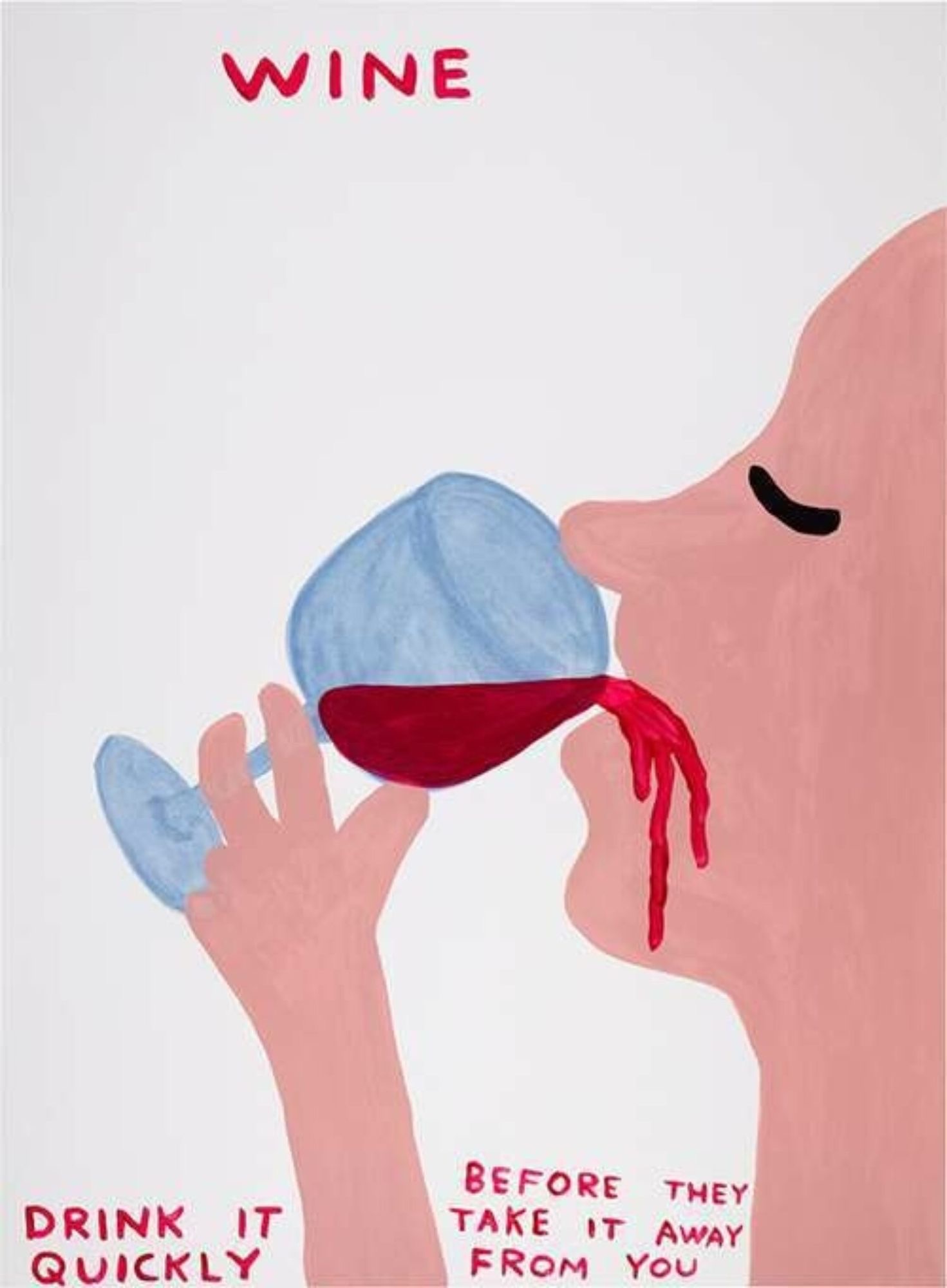 DAVID SHRIGLEY
the register
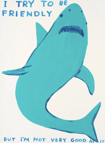 DAVID SHRIGLEY
ref · artistic freedom
For example: the real things people say in a kitchen — our cooking sayings, the ones we believe in: “salt the water like the sea,” “finish with the good oil.” A standing series in a deadpan artistic register (à la David Shrigley), but it teaches food culture instead of gags — endlessly repeatable, deeply shareable, the education always on. (Likely made in-house.)
HALL OF SWORD16 / 25
PLATE 17 · THE BUNDLESAMPLE THE RANGE · A GIFT · AT SCALE
Not singles. Sets.
The 9-can libraryIM idea · a 3×3 paper grid
JOSÉ GOURMET
ref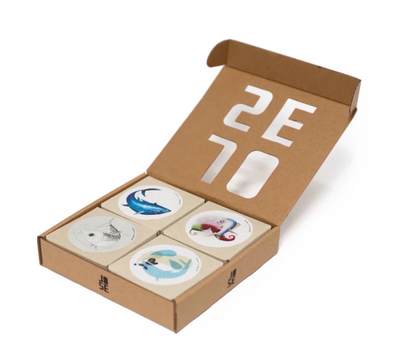
ref
José Gourmetthe sardine set · cut-out box
FISHWIFE
ref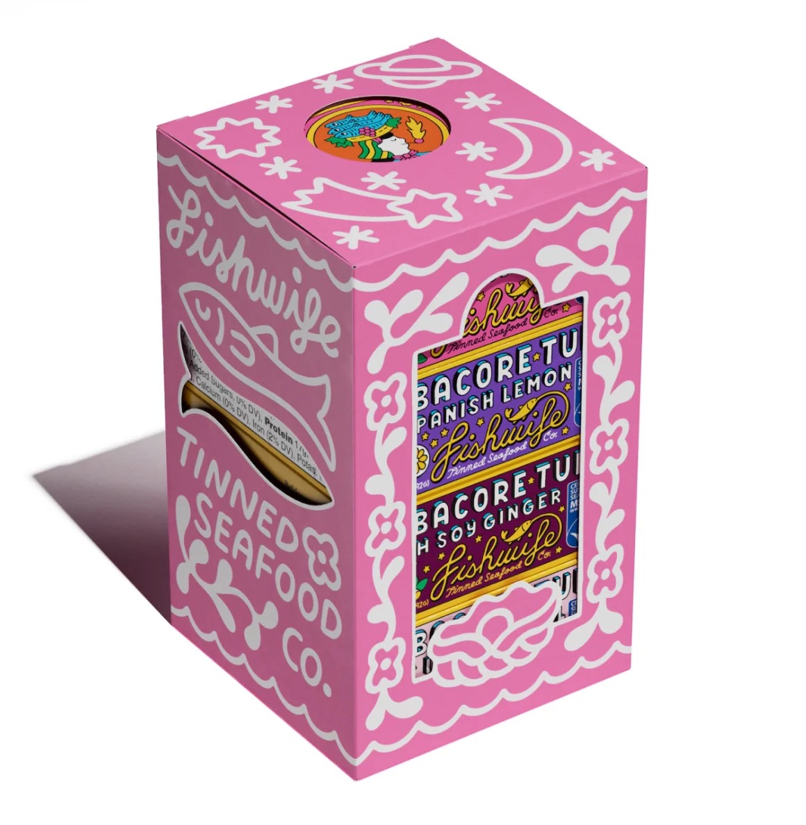
ref
Fishwifevariety pack · pretty at home
FISHWIFE
ref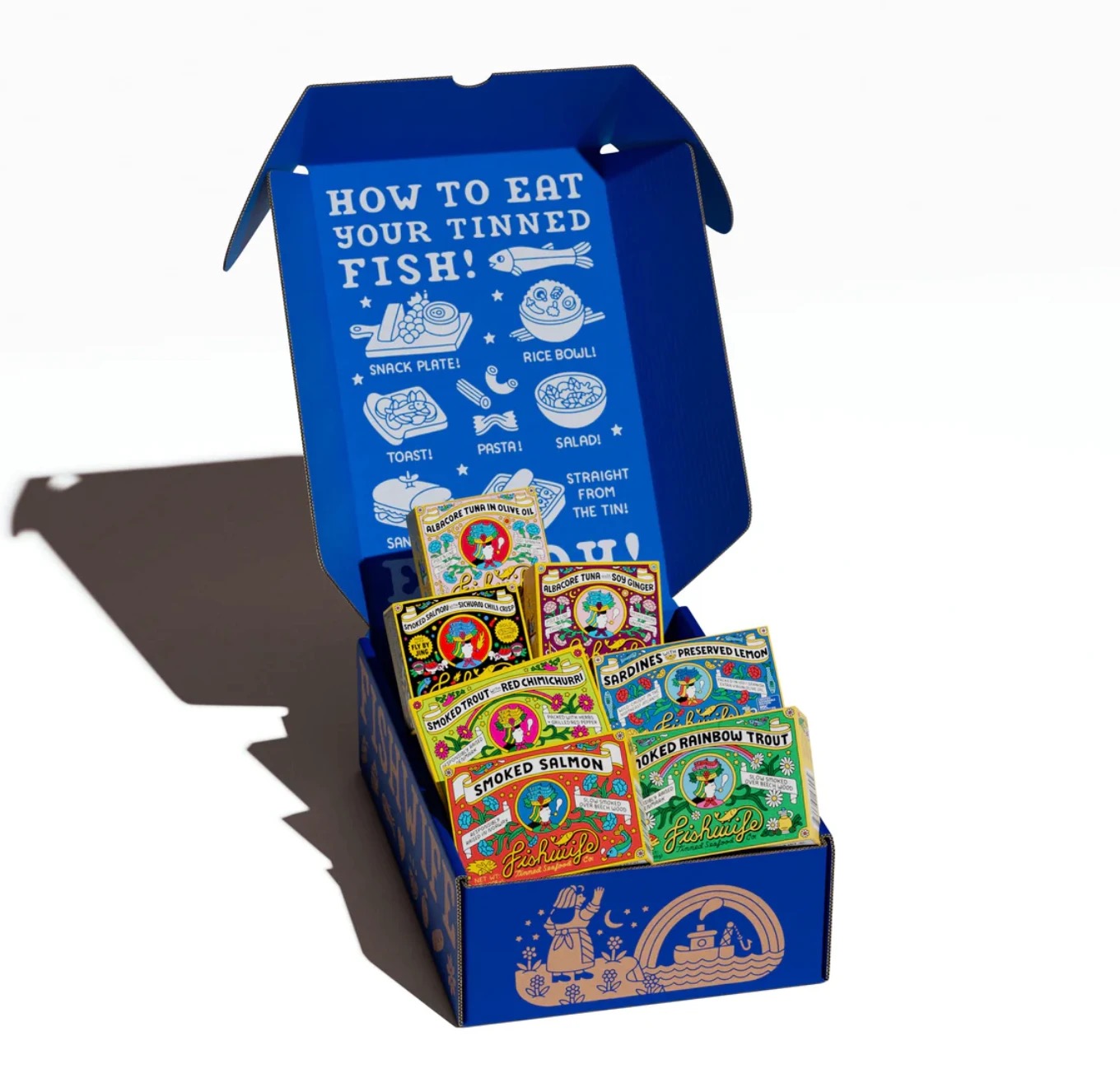
ref
Fishwifethe set + the how-to lid
The object isn’t a single — it’s a set: a 3×3 paper library, a mixed three-pack, a sardine flight. It is the sample pack of the brand’s whole taste and a gift that sells itself — and, underneath, the high-volume, highly modular way to put the visual system to work: the same label logic, boxed and multiplied, sharp on the ICA shelf and lived-out at home. This is the version built to scale. There is also a rarer one — a limited edition made for the inner circle and the people who seed us. That comes next.
HALL OF SWORD17 / 25
PLATE 18 · THE BARLIMITED EDITIONS · ART × OBJECT
Off the shelf, into the room.
The collaborations don’t stop at packaging. We’d commission artists to make limited-edition, food-adjacent objects — shakers, servers, vessels, tableware — each a real edition, each merging product and art. It moves the brand off the supermarket shelf and into interior design and lifestyle: a name you don’t just cook with, but furnish a room with. The objects above are the register — the direction, not the catalogue.
HALL OF SWORD18 / 25
PLATE 19 · THE MERCHA WORLD, NOT A LOGO
A world you can own a piece of.
01Cooking merch & gadgetsthe pourer, the spoon, the tools you actually reach for
02Hats & apparela few pieces, editioned — worn, not branded
03Food-related collectors itemstins, jars, limited runs — the archive, for sale
04Curated goodsthe shop as a point of view, not a merch table
× NO MASS STUFF — no logo’d swag · no cheap tees · nothing you’d throw away
The brand extends into objects worth keeping — cooking gadgets, a hat, a collectible tin. Curated, editioned, desirable. Never a logo on a cheap tee: the merch is the world, not the swag.
HALL OF SWORD19 / 25
PLATE 20 · THE ENGINEONE FLAGSHIP · MANY SIMPLE
A media house, not an ad budget. Watched, not broadcast.
THE FLAGSHIP
The voyeur
The voyeur
taste-tour
A road & sales trip across the map — ~50 stops, shot close enough to feel stolen. Taste authority, indie texture, sponsored low-key and never super-branded. The one strong idea that introduces the whole world.
… on top of a lot of simpler, always-on ideas:
How-to field notesCook · Layer · Finish
Educational stills & videothe pour, the colour
Always-on campaign imageryproduct-as-object
Lifestyle product stillscounter · table · hand
Recipe reelsshort · saveable · the dish
Reposts & the seeded networkchefs · wine bars · hosts
The flagship is a voyeur food-tour — a worldwide road trip, the great introduction. Around it runs the always-on engine: education, campaign imagery, lifestyle stills, reels. One strong idea over many simple ones — the product rides inside the content, never on top of it.
HALL OF SWORD20 / 25
PLATE 21 · THE SHOWTHE AUTHORED WAY TO PRODUCE
Not a content format. A show with a host.
KEITH FLOYD ⇄ HUGO
4:5 · B&W
 KEITH FLOYDHUGO
The host
Keith Floyd ⇄ Hugo
→ a person on camera, no script
4:5 · B&W
KEITH FLOYDHUGOHI-OCTANE
4:5 · B&W + GRAIN
Hi-Octane
Coppola & Cassavetes · US, 1994
→ sets the production tone
4:5 · B&W + GRAIN
SPAIN… ON THE ROAD
4:5 · B&W + GRAIN
Spain… On the Road Again
Batali + Gwyneth · US, 2008
→ part lesson, part sell · digestible
4:5 · B&W + GRAIN
Three references, one method. A host with real character, on camera and unscripted — Keith Floyd, and our Floyd is Hugo. A high-octane production tone. A format that is part lesson, part commercial, always digestible (Spain… On the Road Again). Together they make an authored way to produce — the way Vice and Fuck That’s Delicious each have their own. Not a content calendar; a show with a point of view.
HALL OF SWORD21 / 25
PLATE 22 · THE SEEDHUGO → THE MARKET
Hugo at the centre. The market at the edge.
It starts with Hugo and the ten he knows — give them the special treatment, and each ripples out. The mechanism is inception: seed those first ten deeply enough and each carries the belief to roughly ten more, who carry it to ten more again. Plant the first seeds well and the ring propagates itself — geometric, organic, self-funding. No PR agency required; Graza proved it with a 300-bottle seed run off a real list.
HALL OF SWORD22 / 25
PLATE 23 · THE ENGAGEMENTTWO PATHS FORWARD
Two ways to work with us.
Two paths, your call. One: we hand you the concept and the one-off pieces, and you attach any producer team to execute. Two: we run the whole production, ongoing — the media house, built and operated.
HALL OF SWORD23 / 25
The plate a canvas, the pour a gesture, the tin a readymade nobody thought to sign. Culture eats itself and asks for seconds. You have seen how we see it now. You choose what comes next.